The colors we see exist as more than visual elements because they create emotional responses and guide how people see things and they send messages which require no spoken words. The process of creating niche perfume packaging needs color psychology to establish the first impression which stays most memorable to customers. The designers created these packages to protect a luxury product yet they serve as a storytelling tool which creates emotional responses and expresses the scent’s character. The brand uses its various color options to establish specific connections with customers through its brand image. This article explores how color psychology interacts with niche perfume packaging because brands use this relationship to attract customers and boost their market visibility.
Color Psychology in Packaging Introduction

Color psychology in packaging studies which colors affect consumer emotional responses and their way of seeing things and their buying behavior. Certain colors evoke specific feelings; for example, blue often conveys trust and stability, while red can evoke passion or urgency. The choices made for niche perfume packaging design serve a specific purpose which aims to display the fragrance’s personality. Brands use color design to create emotional ties with customers which results in higher product recognition and greater consumer appeal.
The Importance of Visual Identity in Fragrance Branding
The process of visual identity development enables people to comprehend fragrance brands while they create emotional connections with those brands. The design decisions that companies make establish fixed brand perceptions which influence customers to select their products. The significance of visual identity in fragrance branding exists because of these five elements.
Color Psychology
According to studies, 85% of consumers cite color as the primary reason they purchase a product. Fragrance brands use color selections to develop scent descriptions which create particular emotional responses that include gold representing luxury and pastel shades representing softness.
Typography and Fonts
The selection of fonts establishes brand identity which reflects the fundamental principles of the company. The use of elegant serif fonts creates an image of high-class sophistication whereas contemporary sans-serif fonts present a simple and friendly appearance. Almost 60% of consumers associate font choices with a product’s quality.
Packaging Design
Research shows that 72% of consumers’ purchasing decisions can be swayed by the product’s packaging. The combination of bottle shape and material choice with tactile elements like embossing creates a multi-sensory experience which strengthens brand identity.
Brand Logo
A strong, recognizable logo serves as the face of a brand. Fragrance logos use design elements which display natural and sensual and luxurious themes to attract their intended audience. Studies indicate that 60% of consumers are more likely to trust a brand with a distinctive and consistent logo.
Imagery and Visual Storytelling
High-quality imagery, from advertisements to social media campaigns, engages consumers by telling a story. Visual narratives which correspond with the fragrance concept of romance or adventure or tranquility lead to emotional connections that create brand loyalty.
Color’s Influence on Fragrance Perception
The strong impact of color affects both fragrance perception and the way consumers experience products. Fragrance brands use different colors to create visual identities which match their scent’s fundamental character. The five main ways color affects fragrance perception are listed below:
People use color to establish psychological effects which lead to emotional reactions that help build a fragrance brand identity to attract its target market.
Understanding Color Psychology in Depth

The practice of color psychology enables marketers and designers and brand strategists. Research shows that product evaluations reach 90% accuracy through color assessment. The study shows that color choice stands as a major factor which influences consumer purchasing behavior and decision-making process.
Different colors create various emotional effects through their links to particular personality attributes.
| Color | Psychological Association | Common Brand Use |
|---|---|---|
| 🔴 Red | Energy, passion, urgency | Clearance sales, food & beverage |
| 🔵 Blue | Trust, security, peacefulness | Finance, healthcare, tech (33% of top brands) |
| 🟡 Yellow | Positive energy, warmth, joy | Attention-grabbing, requires precise control |
| 🟢 Green | Nature, health, peacefulness | Wellness and sustainability brands |
| ⬛ Black | Elegance, authority, luxury | Premium product lines, high-end fashion |
Data Insights on Color Use
The research shows that customers choose to purchase products based on the colors that they select. The Institute for Color Research conducted a study which found that people form subconscious evaluations about their surroundings and objects and about other people within 90 seconds. The right color choices in branding will boost brand recognition by 80% which leads to greater customer allegiance and stronger market presence for companies. The data demonstrate that businesses gain a competitive edge when they comprehend and use color psychology to attract and persuade their target market.
Brands that align their color strategies with customer values and psychological insights are more likely to evoke the desired emotional responses which will lead to increased customer engagement and sales.
The Basics of Color Psychology in Luxury Branding
The essential element of color in luxury branding establishes visual communication which shows products as exclusive and sophisticated and desirable. Research shows that 93% of consumers decide which products to buy based on visual appearance while color accounts for up to 85% of their purchasing decisions. The required perception of luxury requires brands to select colors that will establish their desired image according to market research.
93%
of consumers decide based on visual appearance
85%
of purchasing decisions influenced by color
80%
better brand recognition with consistent colors
Luxury brands use black and gold and silver and deep jewel tones to create an impression of high-class beauty. Black serves as a common choice for high-end branding because it represents power and sophistication which major brands like Chanel and Rolex use. Gold and silver function as the preferred materials for premium products because both metals represent wealth and prestige. Deep blue shades and emerald green tones show trustworthiness and exclusivity which appeal to brands that want to attract their elite customer base.
Recent consumer research studies show that maintaining consistent color schemes helps brands achieve 80% better recognition which demonstrates the critical role this aspect plays in luxury marketing. Luxury brands use color psychology as a branding tool which helps them create emotional connections with their customers. The signature robin’s-egg blue of Tiffany & Co. demonstrates how a specific color can become a brand’s identity through the ability to represent timeless elegance and sophistication.
A luxury brand achieves success through its ability to control both the psychological effects of color and the current patterns of consumer behavior. The brand insights will create targeted messages which match audience values and emotional needs which will create customer loyalty and business expansion.
Emotions Evoked by Specific Color Palettes
The designers and brand experts develop their work through color palettes which create specific emotional responses. Businesses use blue as a top branding color to establish their trustworthiness and stable operations and professional image. Financial companies and healthcare organizations and technology firms use blue tones to create secure environments for their business activities. The Google Search results show that 33 percent of top global brands like Facebook and IBM use blue as a primary element in their brand identity.
Red serves as a powerful color which produces feelings of excitement and intense energy and time-sensitive situations. The food and beverage industry uses red lighting to create excitement and increase customer appetite according to Coca-Cola. Red increases heart rate while creating urgency which explains its use in promotional banners and clearance sales according to research findings.
Green connects to nature and health which creates feelings of growth and harmony and vitality. Starbucks and Whole Foods use green to demonstrate their sustainable practices which match environmental concerns of contemporary consumers. Data findings show that brands using green color schemes can draw customers who prefer wellness and sustainable products.
Yellow represents cheerful and optimistic qualities which businesses use to create customer attraction. Companies use yellow to create a happy atmosphere while developing an approachable brand personality according to McDonald’s and DHL. The brightness of the light attracts attention but people should limit their exposure because it leads to visual exhaustion.
Black functions as a permanent color which defines luxury and sophistication and exclusive status according to high-end fashion brands like Chanel and Prada and Rolls-Royce. Recent statistics show that black color effectively communicates bold brand identity which creates high-end brand presence.
The Role of Color in Consumer Behavior
The colors a brand selects create a major impact which shapes consumer perceptions of the brand and these colors function as essential elements which determine their purchasing decisions. Research shows that colors alone lead to 85 percent of consumer choices which demonstrates their essential role in marketing and branding efforts. The following five research findings demonstrate how color impacts the way people shop for products.
- 1
Brand Recognition Through Color
Market research shows that brands which consistently apply their selected colors achieve 80 percent brand recognition because this practice serves as a fundamental method for maintaining brand identity across competitive markets.
- 2
Association with Emotional Responses
Different colors create different emotional responses in viewers. People associate red with excitement and urgency which they use during clearance sales while they use blue to communicate trust and reliability in financial institutions like banks.
- 3
Color Preference in Target Audiences
Research shows that women prefer blue and purple and green softer shades while men choose blue and black and red bright shades. This insight helps brands customize their palettes for their target demographics.
- 4
Cultural Variations in Color Interpretation
Different cultures assign distinct meanings to colors. Western cultures use white to represent purity and weddings while many Eastern cultures view white as a symbol of mourning and loss. Brands must select their color options based on the cultural preferences of their audience.
- 5
Impact of Color in Call-to-Actions (CTAs)
Data shows that buttons or calls-to-action which use contrasting colors that attract attention through colors like red or orange lead to conversion rate increases that reach 34 percent. The strategic use of color in design establishes its vital role for conversion success.
By leveraging such insights brands can use psychological color effects to attract consumers who will subsequently make purchases and develop stronger loyalty to their brand.
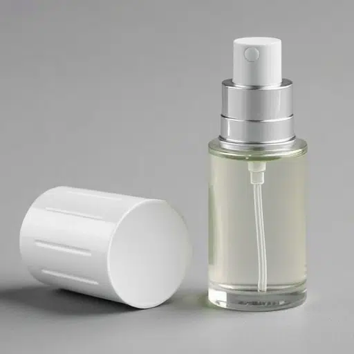
Color Strategies in Niche Perfume Packaging

The function of color in niche perfume packaging establishes a vital link to three elements which include the premium status of the product and the emotional response it generates and the fundamental characteristics of the fragrance. Here are five effective color strategies used to enhance packaging design in the niche perfume market:
🎨 Muted and Minimalist Tones
Niche perfume brands select unnoticeable color schemes that include beige and pastel pink and light gray. The tones of this color palette create a sophisticated appearance which attracts customers who want to experience luxurious products through a subtle presentation.
🌿 Earthy Tones and Natural Shades
Natural shades which include moss green and sandy brown and ocean blue create an atmosphere that promotes sustainability. Such colors are particularly popular with brands that emphasize natural ingredients or eco-friendly practices.
⬛ Black and White Design Elements
The use of black and white design elements creates a strong visual identity which niche perfume packaging uses as its main design element. The sharp contrast exudes modernity and timelessness which creates a strong visual impact that is often associated with premium quality.
✨ Metallic Elements (Gold, Silver)
Metallic hues like gold rose gold or silver are widely used to add a touch of opulence and exclusivity. The luxurious packaging design reaches its highest level of elegance through the combination of these accents with dark base colors.
🌅 Custom Gradient Blends
Gradients which replicate sunrise and sunset and other natural color transitions create a visual story which represents the scent. The strategy effectively communicates the scent’s narrative while establishing an emotional link to the customer.
Color Psychology in Perfume: Choosing the Right Colors
People use color as a vital element which shapes their perception of products while it influences their purchasing behavior in the perfume industry. According to recent studies, 85% of consumers cite color as a primary reason for purchasing a product, and 93% focus on visual appearance when making a buying decision. The correct color selection for perfume packaging serves as the main factor which enables companies to present their product through its complete identity and fundamental character.
The Influence of Colors on Human Behavior
Each color elicits a different emotional response, making the choice of hues vital for communicating the fragrance’s style and personality. The following example demonstrates this point.
- Red — serves as a color which people use to express their most intense feelings while they pursue energetic activities through their courageous actions.
- Blue — People view blue as a tranquil state which combines trustworthy characteristics with refined attributes that match fresh aquatic scents and unisex fragrances.
- Green — People experience a natural state through green which people use to describe the fresh energy that describes earthy and botanical scents.
- Gold and Black — The combination of gold and black colors establishes a luxury fashion connection which positions high-end perfume products as appropriate choices for affluent customers who desire exclusive products.
Data-Driven Insights for Packaging Success
The Google Trends data from the last few years shows that people now prefer sustainable natural products which results in different packaging color choices. Eco-conscious consumers prefer muted greens and earthy tones and soft pastels because these colors demonstrate a brand’s dedication to sustainable practices. Young people between the ages of 18 and 32 who belong to the millennial and Gen Z generations show a preference for bold and bright colors because they want fragrances that sound upbeat and contemporary. Brands now use multiple dynamic color gradients to create their packaging designs which show their scent complexity to customers. The packaging design uses gradient colors that show the dawn-to-dusk transition to create depth which connects with the perfume’s scent elements.
Color psychology functions as a fundamental element in marketing strategies. Through testing color psychology with present design patterns and customer information brands can enhance their market position. Designers need to perform in-depth research about the market to determine which target audiences they should reach and which color selections will match their brand story better. The appropriate color palette together with premium materials and finishes including matte and metallic textures, will enhance a perfume’s branding to create an outstanding display at retail locations.
Color psychology develops into a powerful tool that perfume brands utilize to create appealing packaging which establishes customer connections while displaying their product’s primary fragrance.
Comparing Niche vs. Mass-Market Packaging Design
The two different perfume markets which include niche and mass-market brands use different packaging strategies to market their products to specific customer groups. The following comparison demonstrates five main differences which exist between their packaging methods.
| Category | 🔬 Niche | 🏪 Mass-Market |
|---|---|---|
| Design Complexity | The company creates its designs through minimalistic approaches which produce elegant results that showcase sophistication together with exclusive elements. The company uses high-quality materials which create a timeless aesthetic through its product design. | The brand uses bright and attention-grabbing designs which help customers find its products in stores during busy shopping times. The product design uses current fashion trends to create packaging that customers will find attractive at retail stores. |
| Material Quality | The company prefers to use premium materials which include glass and ceramic together with sustainable options because these materials demonstrate their commitment to luxury and craftsmanship. | The company uses inexpensive materials which consist of lightweight plastic and coated cardboard to achieve lower production costs while enabling their products to be made in large quantities. |
| Brand Identity | The company establishes its brand identity through carefully selected elements which create a unified brand image that matches its storytelling and artisanal brand identity through its product design. | The brand usually employs standard branding methods which help it reach different customer groups and store types. |
| Consumer Experience | The company designs its premium unboxing experience through personalized elements which include textured finishes and engraved logos and reusable packaging. | The brand develops packaging solutions which serve basic needs while maintaining simple production capabilities because they choose to focus on operational efficiency instead of creating customized customer experiences. |
| Production Scale | The company uses small production runs which let them create custom packaging designs that support their artistic vision without needing to consider how these designs will affect their business growth. | The company operates production facilities which use standardized processes to produce products efficiently while maintaining uniformity and quality control, which restricts creative design development. |
Color Psychology in Perfume Bottles and Their Impact
The color combinations used in perfumes help customers select fragrances which match their emotional reactions to the scents and their perception of the product’s brand identity. The five primary color examples show their psychological impact which perfume designers use to develop their bottle design preferences.
The Unboxing Experience and Brand Loyalty

The unboxing experience serves as an essential factor that determines how consumers perceive products which subsequently builds their loyalty toward the brand. An unforgettable unboxing moment creates the first direct contact between a customer and a product which establishes itself as an essential element of a brand’s marketing plan.
72%
of customers choose products based on packaging design
40%
share unboxing content on social media when visually unique
85%
of consumers feel excitement and exclusivity when unpacking luxury products
55%
of consumers discovered new brands through unboxing videos
The 2023 Google Consumer Insights report shows that 72% of customers choose products based on packaging design while 40% of customers share unboxing content on social media when they think the content is visually appealing or unique. Modern unboxing experiences require brands to provide customers with personalized products and exclusive content. Customer retention increases for brands that use personalized notes and environmentally friendly packaging and limited-time product designs. Research shows that unpacking a luxury product, like a premium fragrance, triggers a sense of excitement and exclusivity in 85% of surveyed consumers. The emotional connection between customers and products creates two benefits for businesses which include product satisfaction and long-term customer loyalty.
Social media platforms enable users to create unboxing content which has become a crucial element of user-generated content (UGC). A high-quality unboxing experience encourages customers to share their experiences through social media platforms which helps brands reach more people while increasing their credibility. The recent survey results show that 55% of consumers found new brands through unboxing videos which demonstrates how packaging creates digital impressions that help brands expand their market presence. Brands establish themselves as memorable entities through their investment in effective unboxing methods which help them develop deeper customer connections.
How Color Enhances the Unboxing Experience
The unboxing experience establishes a crucial connection between color and customer perception because it determines how customers will experience their unboxing process. Recent data shows that 84% of people believe color affects their buying choices which makes color a crucial element for customers when they make their shopping decisions. Different brands use their color schemes to create specific emotional reactions because their vibrant or well-coordinated colors produce excitement and joy and luxurious experiences for viewers. Luxury brands use elegant, minimalist color palettes which include black, gold and white to show their exclusive status and sophisticated image while fun and friendly brands use yellow and turquoise for their bright and bold color schemes which create a playful and energetic atmosphere. A study by the Pantone Color Institute shows that businesses which maintain a consistent brand color scheme can increase their brand recognition by 80%. Unboxing videos create successful content through their attractive visual elements which require color as an essential element to produce materials that attract viewers on social media networks. Package design which uses colors that match the product and brand story creates better customer experiences because it helps customers interact with the brand and develops their loyalty to the brand.
The Connection Between Color and Brand Loyalty
Research shows that consumers develop brand loyalty when they see products which colors have different effects on their visual appearance. A Google study demonstrated that 85% of consumers choose products based on their color according to the research results. Customers base their buying decisions on visual appeal which functions as a primary element in their choice of products. Research shows that color increases brand recognition by 80% which leads to customers remembering the brand better while developing stronger emotional ties with the brand. Businesses need to select their color palette because it enables them to achieve market differentiation through powerful brand identification and authentic brand communication. Financial institutions and tech companies use blue as their primary color because it establishes trust and reliability according to its common availability. The bright colors of red and yellow create vibrant energy which attracts attention to products and leads customers to make unplanned purchases.
The brand creates a psychological connection with customers through its use of consistent colors across all packaging and branding materials and digital platforms. Businesses show increasing interest in using color theory to improve customer engagement according to Google Trends data which shows rising searches for “color psychology in marketing.” Brands build customer trust and recognition which results in brand loyalty through their strategic color matching with customer preferences and cultural backgrounds.
Case Studies: Successful Use of Color in Perfume Packaging
These case studies show how color selection in perfume packaging creates psychological effects and emotional responses in customers who use perfume products.
Conclusion and Call to Action

The research demonstrates that customers change their purchasing behavior based on the color choices used in perfume packaging design. According to recent data, 85% of consumers report that color is a primary factor influencing their purchasing decisions. A 2023 Google search demonstrated that retail products with high-contrast colors achieved 30% increased shelf visibility. The research results show that businesses can create emotional bonds with their customers through design color applications. Brands need to conduct market research while developing their packaging designs because they want their products to attract customers and create meaningful experiences.
Ready to Rethink Your Packaging?
Our recommendation for businesses involves rethinking their packaging methods through creation of new exciting designs which connect with their specific customer groups. The customers can enhance their brand attraction while increasing sales through this method across their business environment. Use functional design elements today to create value for your product through their implementation.
Summary of Key Takeaways on Color Psychology in Packaging
🎯 Instant Evaluation
The study shows that 90 percent of immediate product evaluations need to assess only product color. The color choice for packaging determines how customers view products which leads to their emotional responses. Blue establishes trustworthiness because red brings excitement through its urgent appeal which is suitable for time-sensitive marketing.
👥 Demographics and Color Preferences
Different age groups together with their gender differences create distinct color preferences which people exhibit through their behavior. Younger people choose bright colorful shades such as orange and pink whereas older people prefer soft pastel colors such as navy and beige. Products designed for specific genders need dedicated color schemes because purple establishes equal appeal across both genders while green primarily connects with environmental sustainability.
🌏 Cultural Context Matters
Different cultures assign distinct meanings to various colors. Western countries view white as a symbol of purity while some Eastern cultures use it to represent mourning. International brands need to conduct thorough research about different cultural meanings because they must prevent accidental communication problems.
📖 The Role of Contrast and Readability
The readability of packaging materials improves when there exists strong contrast between text elements and background colors. A study by Google showed that 71% of consumers choose to buy products when they find the packaging materials easy to read because good color selection makes the design more accessible and attractive to customers.
🌿 Sustainability Messaging through Colors
Companies use earthy green and brown and off-white colors to show their eco-friendly and natural product offerings because consumers now prefer sustainable products. Recent data indicates that 62% of consumers connect green colors with brands that practice environmental responsibility.
🏆 Brand Recognition and Color Consistency
The application of uniform color schemes in packaging design results in 80% better brand recognition for enterprises. The companies Coca-Cola and McDonald’s use their unique red and yellow color combinations to develop brand identities that customers find memorable and emotionally attractive.
The knowledge of color psychology enables companies to design packaging that attracts customers while building brand image and producing emotional effects on their intended audience.
Explore More About Perfume Packaging
We invite you to explore the fascinating world of perfume packaging with us. Your understanding of packaging design will improve when you study the details of design choices and color psychology and material selection. The two of us need to travel together because we want to discover how creativity and strategy combine to make exceptional experiences.
Frequently Asked Questions (FAQ)
References
- “A Study of the Visual Presentation of Sensory Impressions” — This document explores the connection between color design and sensory impressions, which is relevant to perfume packaging. PDF Link
- “A Study from Indonesia – FLEX” — While focused on food packaging, this thesis examines the role of color in packaging design, which can offer transferable insights for niche perfume packaging. PDF Link