The creation of a bottle for a fragrance is not just an artistic or aesthetic decision—it becomes a master key that reveals the essence of the scent to the human spirit and makes a psychological contribution to the customer’s behaviour. The very shape and structure of a bottle can give a particular character, style, and mood, and become a decisive factor in the purchase. The discussion of this article focuses on the interplay between the design of the perfume bottle and the unobtrusive messages it conveys to users. By going deep into the psychology of design, we will see that the very form, evenness, and material features of the thing can create an emotional bond and drive the user to make a choice. Whether you are a designer, marketer, or just a casually interested person, this information shows that the bottle’s contour and fragrance together embody the company’s morals.
Understanding the Psychology Behind Perfume Bottle Design

A study claims that the shape of the glass bottle has a very significant impact on how people perceive a scent, especially when its design elements can activate emotional reactions and cognitive processes. Balanced and straightforward designs generally convey minimalism and grace. They are thus more attractive to consumers who want to convey a luxury feeling, unlike striking or uneven shapes, which can be associated with art and therefore attract customers to niche or avant-garde fragrances. The literature on design psychology indicates that the kinds of form can be related to personal values in people’s minds; hence, visual values must be the most important for the buyer, at least in the subconscious.
The Role of Shape in Consumer Perception
Preliminary results indicate that a product’s form can change in response to perceived functionality and value, as well as in ways that attract shoppers initially. One case in point is the angular design, which is often associated with images of power, longevity, and precision, making it very popular in industries such as automotive and technology. On the contrary, roundness is a feature people usually associate with openness, safety, and convenience, making it the best form for products in healthcare or family-oriented industries. Statistics from market research further indicate that, in addition to consumer trust and brand loyalty, a product’s form can also play a significant role in attracting or repelling customers when it matches the message. Furthermore, brain studies show that certain signs can unconsciously expand shopping behaviour. This information calls for the incorporation of shape design methodology in product development to favor ultimate market success.
How Design Shapes Influence Emotional Responses
New research and data analysis show that certain design forms have an inherent power to shape how buyers think about a product or brand. It is scarce, for example, that round shapes aren’t connected to the features such as gentleness, friendliness, and comfort, and that is why they always rule the pack in sectors like personal care and cosmetics, or leisure and wellness services, where the main targeting is to create a relaxed or pleasant environment. On the other hand, you are usually unable to separate angular shapes from concepts such as strength, security, and discovery, so in industries such as technology or the automotive sector, these shapes are frequently chosen as the “ones” opposed to the rest.
This association between form and emotional response is supported by new datasets on the market, which show the effect of different geometric designs on neural activation. It is noted that shapes that combine complexity and symmetry can elicit more positive sensory reactions, thereby prompting longer engagement with the interaction or attention. This clear, quantifiable correspondence between design and user psychology points to the need for brands to prioritize shape selection and testing as a parallel process to the design to ensure it resonates with the emotional triggers and expectations of the target group.
Successful Bottle Designs and Their Impact
It is commonly acknowledged that successful bottle designs serve more than just superficial purposes, as they have tremendous power to shape consumer behavior and brand perception. Several studies show that user satisfaction is directly affected by a human-friendly bottle—one that is easy to grip and carry. Not only that, it becomes very easy for consumers to focus on their product selections: they simply go by the most attractive shape, color, and material. The consumers’ gaze shifts in a different direction as a result. In turn, consumer trust and the likelihood of purchase go hand in hand when transparent materials are used. The brand is further strengthened by the use of sustainable resources aligned with today’s eco-friendly materials trend. Making these and similar reasons the main subject of the research puts bottle designs closer to people and makes them a strategic marketing resource.
Color Psychology and Its Effects on Perfume Bottles

The influence of color psychology is fundamental when it comes to a consumer’s perceptions of a perfume bottle and how they shop. Selecting specific colors is a way to get the target group excited and happy; for example, a golden bottle conveys luxury and is unlike anything else. Palettes with soft colors like pink and lavender on their sides mimic flowers and romance, and that’s why we see them paired with flowers and delicate fragrances so often. Red and black on the opposite side create a scent that is very suited to the most passionate and daring people in the group; such scents are usually stronger and meant for evening use. By identifying their brand and their customers’ emotions, and selecting colors that align with the intended brand message, companies can increase the product’s attractiveness and marketability to a considerable extent.
The Significance of Color in Packaging Design
Key Insight: Color psychology is one of the main factors that determines consumer choice, especially in packaging design. 85% of consumers cite color as a significant factor in the products they buy.
Different tints of color elicit different kinds of emotional and cognitive responses, which is why companies can adopt their brand strategies most efficiently by using colors that represent their products. For example, blue is commonly associated with trustworthiness and professionalism. Therefore, it is the most common color used in corporate and technology brands. At the same time, green is a color most closely associated with health, sustainability, and natural purity, and it is the perfect color for eco-friendly or organic complementary products. Moreover, a study has shown that color consistency is critical. When packaging and branding materials use the same color in a very harmonious way, this can raise brand recognition to 80% and is a strong way to give the product a recognizable identity among consumers. The brands that incorporate these considerations into their packaging design will have a more substantial market presence and connect more closely with their target audience.
How Bottle Colors Influence Consumer Choice
The hue of a container is a critical factor in consumer perception, likes, and consequently, buying choices. Research on color psychology shows that specific purple tints elicit distinct emotional and psychological reactions. For example, green and the like, to cite a few, are often related to health, sustainability, and nature; consequently, it is the most chosen color for products that are nature-friendly and organic at the same time. The portrayal of a product’s brand image in the light of honesty and ease of use is conveyed through clear bottles that imply purity and transparency.
The quality of distinctions established by the data is that the more opaque a bottle is, the more likely it is to be associated with luxury, exclusivity, and sophistication. These colors, black and deep blue, for example, are still among the most prominent in the list for use in premium essence, perfume, and the like products that claim high quality. The use of light shades, such as red, in products targeted at the young generation is intended to convey a sense of energy and vitality, thereby attracting the target market’s attention and entering the market.
In addition, the choice of color can be swayed by the regional and cultural tastes. By way of illustration, in one place, the golden and silver colors might suggest to people a high social position. At the same time, in another, softer pastel might be popular among people with qualities of gentleness and mildness, due to cultural associations. It is known that companies can achieve greater consumer appeal and create a much stronger emotional connection with their audience by adjusting the bottle’s hue to align with customers’ expectations and subtle cultural differences.
Effective Color Use in Perfume Branding
Color psychology is significant for consumer perception and interaction with perfume products. Research suggests that different colors elicit distinct emotional responses to a large extent, which may heavily bias purchase decisions. For example, the dark, rich shades of burgundy or emerald green are often associated with luxury and exclusivity. They are, therefore, the perfect fit for premium perfumes or niche-market perfumes. On the other hand, lighter, more cheerful colors, like coral or aqua, can express the human emotions of freshness and vitality. At the same time, they would be suitable for the youngest demographic or for perfumes marketed as light and airy.
Besides, the trend towards sleek, see-through styles is intensifying, so a clear design that conveys purity and sophistication is a key feature. The growing desire of buyers for items like cars to be made more eco-friendly would also mean we could use very natural tones like browns and greens, which are often associated with the idea of sustainability. Companies that leverage the above trends, supported by effective design strategies, will be able to speak to their audience eloquently, ensuring a match between the perfume’s visual and narrative and the target group. Companies that understand not only color science but also the consumer preferences that never stay the same will be the most influential in this ever-tougher market.
Materials and Texture: A Sensory Influence

Materials and texture play a crucial part in shaping how customers view a product. Materials that are of high quality, for instance: glass and sustainably sourced wood accents, have the power to make the customer feel as if luxe, natural materials surrounded them, while textured finishes such as the use of matte or embossed pattern designs can interact with touch to the effect of product depth in design. According to research, textures dictate emotional responses to the point that it is almost mandatory to use them for branding and to align with target market preferences, which can be considered a significant element in the packaging’s perception of availability to the brand and its target consumers. An excellent selection of materials and textures paves the way for the same sensory experience and a stronger relationship between the product and its consumers.
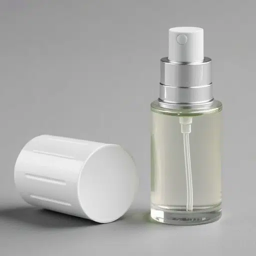
The Impact of Glass vs. Plastic Perfume Bottles
| Parameter | Glass Perfume Bottles | Plastic Perfume Bottles |
|---|---|---|
| Durability | Fragile, prone to breaking | Highly durable under normal conditions |
| Environmental Impact | Recyclable, less harmful to environment | Non-biodegradable, high environmental cost |
| Aesthetic Appeal | Premium, luxurious appearance | Simple, less elegant design |
| Weight | Heavier, less portable | Lightweight, travel-friendly |
| Cost | Higher manufacturing and material cost | More economical production costs |
| Chemical Stability | Non-reactive, preserves fragrance quality | Possible interaction with contents |
| Customization | Enables intricate shaping and detailing | Limited design flexibility |
| Sustainability Practices | Energy-intensive production but recyclable | More energy-efficient but non-recyclable |
| Heat Resistance | Excellent resistance to heat | May deform under high temperatures |
| Consumer Perception | Associated with luxury and quality | Linked to affordability and practicality |
Textural Elements and Their Psychological Effects
Texture characteristics are a vital aspect in shaping consumer viewpoints and stimulating diverse emotional responses. For example, if a material has a smooth surface or has been polished, its various attributes are easily associated with luxury, elegance, and a sense of sophistication. Besides, such materials convey a sense of quality and good taste, which is why they are primarily used in luxurious goods and minimalist designs. However, roughness and coarseness typically hint at toughness, longevity, and authenticity, making them very attractive to those who like no-nonsense and homespun beauty.
It has come to light through the examination of goldsmithing, among other things, that texture can be a significant factor in touch perception and, consequently, in emotional responses and buying decisions. The rugged and resilient character of rough textures, on the one hand, and the comfortable and warm (association of) soft or cushioned textures, on the other, are among the most familiar contrasts in this category. Moreover, visual texture—which (may also be) defined by patterns or finishes—is the one that the best way to make a compatibility between a product design and a brand’s-related concept, impart further portable advertising messages and to widen the market range of demographics perceived as the target audience.
Consumer Preferences for Sustainable Materials
There has been a significant shift in customer choices towards sustainable materials, with consumers increasingly seeking eco-friendly, ethically produced products across several sectors. A study shows that current consumers are giving greater importance to materials with a lower environmental impact, e.g., recycled plastics, vegetal fibers, and the like. Ways to reduce environmental impact through material use include transparent supply chains and authentic certifications (FSC for wood-based products and GOTS for textiles). They are the two main points now affecting people’s buying decisions, as they certify the claims as sustainable.
Consumer Insight: Research indicates that younger consumers, especially Millennials and Gen Z, are driving demand, with 62% of Gen Z consumers ready to pay more for eco-friendly products.
The very processes of innovation in the automotive, fashion, and packaging industries, and, as a result, the advanced use of materials such as plant-based leathers, recyclable composites, and zero-waste designs, play a significant role in this change. This shift not only makes it clear that customers are increasingly looking for eco-responsible companies, but also shows that firms need to adjust quickly to meet these expectations while maintaining the same performance and cost efficiency, and being the most cost-efficient.
Branding and Typography in Perfume Packaging

Typography has a decisive impact on a perfume brand’s packaging, as it conveys the product’s identity, chic, and appeal. The choice of fonts, spacing, and type size can express the brand personality— be it luxurious, minimal, or young. Typographic construction and design can actually reveal the brand character represented by a particular typographic face; that is, where a designer may choose among a wide variety of fonts, including serif types that usually associate with sophistication and tradition, as well as sans-serif styles that underline modernity and plainness. Moreover, the very location and order of text components, such as a brand name, fragrance type, and product details, affect the clear communication of information and visual equilibrium. The use of the right typography not only makes the product’s visual appeal more charming but also identifies the brand and distinguishes it from similar products more effectively.
The Importance of Label Design in Consumer Psychology
The appearance of labels is a significant factor that can affect consumer decisions, as visual aspects evoke psychological reactions that tap into emotional elements. A recent survey reveals that in-store shopping choices account for 60% of total purchases, underscoring the importance of labels that draw the customer’s eye quickly. Consumers are quick to evaluate a product subconsciously, and therefore, the presence of visual clarity and branding consistency becomes even more critical—potentially a deal-breaker.
The role of color psychology in creating a label is indeed vital, as specific colors can evoke feelings and, in turn, change behavior. For example, red is associated with joy or emergency, while blue is said to be the color of trust and credibility. Moreover, the use of pictures, multi-layered designs, and the like adds to the entire label’s charm through the senses. Some research also finds that products can be given greater value through the sense of touch, for example, by using embossed or matt finishes.
In addition, following legibility guidelines, such as font size and contrast ratios, is a two-way street, ensuring product accessibility and reinforcing consumer trust. In the same vein, one should ensure that the labels are not only attractive but also include the most important product details, such as ingredients, certifications, and sustainability-related claims, as consumer preferences increasingly lean toward a “know thy product” democracy today. Beauty combined with the utilitarian elements of the label design makes it a compelling yet very subtle way to control consumers’ perceptions and buying behavior.
Iconic Perfume Brands and Their Labels
Luxury and big perfume brands have always been the flag-bearers in promoting label design, as it is part of the brand’s identity and a primary factor in consumer appeal. The world-renowned fragrance Chanel No. 5, for example, uses a straightforward and unassuming label design, yet it is the brand’s signature sophistication. The classic ‘black and white’ label design, centered on the typography and free of visual chaos, conveys a sense of seriousness and refinement, aligning with the brand’s reputation for opulence and grace under the radar.
Dior’s J’adore is another renowned fragrance well known around the world for its luxury and femininity, as represented on its label. Gold and nice fonts are used in the design, so the fragrance’s character—flowery and luxurious —mirrors it. This design not only attracts consumers through visual appeal but also creates a strong bond with the brand’s message of glamour and refinement.
On the other hand, Le Labo’s label is very unique and distinctive, as it draws inspiration from its roots and a personalized approach. Every bottle has a label made by hand that contains the fragrance’s name, when it was made, and even the name of the person the perfume was given to, if such a request has been made. And all of this will just show the company’s focus on handmade products and the dreams of its clients that have come true.
The iconic perfume brands embed label design into their marketing strategy in a way that the image of value speaks louder through visual communication elements. At the same time, the identity becomes stronger, and the audience is reassured by the visuals they are most familiar with. The choices are more than just beautiful; they have also proven to be very strategic in serving the brands in a market where competition is highly crowded.
Creating Emotional Connections Through Design

Designing to appeal to users’ emotions is about understanding the brand’s target audience’s desires, values, and aspirations, and then working to satisfy them. The custom colors, fonts, and pictures used in the design of a product or service are not picked by hazard but to produce certain feelings that match the brand’s personality and message. For example, warm colors are often associated with energy and excitement, whereas simple fronts can signify elegance and reliability. Researchers have consistently stated that emotional design of this nature not only makes the brand name easier to remember but also contributes to the conversion process through association or even aspiration. By linking the non-verbal elements of brand identity that resonate with the audience, brands can forge a more intimate and lasting relationship with consumers by turning a product encounter into a personal bond.
The Role of Storytelling in Bottle Design
The art of narrating bottle designs is the key aspect that lets the brand express itself, connect with buyers on an emotional level, and stand out from rivals in segmented markets. The thoughtful bottle design, with its shapes, materials, colours, and images, as well as its visual and tactile attributes, can make customers feel the brand’s emotions. One way of doing this is to take examples from the “art nouveau” or “art deco” period; those styles can communicate a sophisticated, stylish, and yet natural feel, with beautiful labelling and the right colours.
Research has shown that customers perceive products with solid, coherent narratives in packaging as more genuine and reliable. In doing so, this leads to increased buying desire. Further, the introduction of culturally appropriate or location-specific symbols into a product’s design can indeed strengthen the emotional bond between the company and consumers in this specific place. The breakthrough in the digital printing sector also brought along much flexibility in the use of delicate patterns, personalized texts, and very colorful editions. By designing a bottle that is intended and strategic, brands can easily replicate the narrative with their values and ethos, thus transforming packaging into a strong communication medium.
Future Trends in Perfume Bottle Design and Consumer Engagement
The future of perfume bottle design is closely connected to sustainability, technological integration, and personalized consumer experiences. Due to increasing environmental awareness, companies will most likely switch to eco-friendly materials, such as recycled glass, biodegradable plastics, or refillable packaging, to reduce waste and align with consumers’ wishes for more environmentally friendly practices. At the same time, developments in innovative packaging have opened new ways for consumers to engage with products. RFID chips embedded in the package, QR codes, and even an augmented reality (AR) feature could offer users the chance to explore an interactive story, access ingredient transparency, and even virtually test the perfume by seamlessly using their mobile phones.
One more emerging trend is hyper-personalization, which means companies use AI-driven data to create unique clothes and fragrances tailored to people’s preferences. Thus, producing special-edition bottles with unique encryptions, differing parts, and features that represent demographic and cultural affinities identified through marketing research is a possibility. In addition, the combination of abstract and clean lines in products is advancing as well, reflecting a strong interest in quiet yet costly brands. The ones that combine these extraordinarily diverse aesthetic directions with an extra layer of narrative and experiential promotion can expect a stronger bond with consumers. Thus, they are at an advantage because they are at the forefront of a competitive, ever-changing market.
Reference Sources
Potential Dimensions of Consumers’ Affective Responses to Perfume Bottle Design
Key Findings: This paper identifies dimensions such as “suitability” and “emotional association” that influence consumer perceptions of perfume bottle forms. It emphasizes the role of emotional connections in design.
Construction of Perfume Bottle Visual Design Model Based on Consumer Psychology
Key Findings: This research provides a theoretical framework for understanding how product imagery, such as bottle design, captures consumer attention and communicates brand values.
Frequently Asked Questions (FAQs)
How do bottle colors influence consumer preferences in the perfume industry?
A captivating aspect of the perfume industry might be the psychology of bottle colours. The ability of these colours to evoke precise emotions, along with the associations they carry, can significantly affect consumers’ actions. Blue bottles may imply freshness and calmness, whereas bright colours such as red might trigger passion and spark. To put it simply, the bottle’s color psychology is like a silent salesman working in the background for the brand. They love the fact that consumers are unofficially influenced through the means they know will be highly effective — visual inputs. In turn, the relationship between colors and emotions, an essential part of the human psyche, is being exploited by brands in a strategic manner to influence consumers subliminally. To make the story short, a cute baby playing with his cat might be the consumer’s mind, and the fragrance colors the retailer’s primary and most strategic tool in such a story.
What are the trends in perfume bottle packaging design?
At present, the market is full of fragrances that embody minimalism and green production, even being eco-friendly. Plenty of perfume brands are now focusing on sustainable packaging that not only attracts consumers who care about the environment but also enhances the perfume’s overall aesthetics. The shape and line usage in the process of drafting a perfume bottle are becoming more minimal and more alike, which is a current design trend that draws heavily on the minimalist design world. This trend not only looks good but also generates less waste as companies use less packaging for their products. Moreover, there is a growing trend toward the use of airless bottles, as they not only have a unique look but also help preserve fragrance intact and make the whole process mess-free. All of these trends make it clear that the industry undergoes a slower but quite noticeable change in the way perfumes are made and presented.
What role does the design of the bottle play in creating a luxury fragrance experience?
The bottle design is one of the key factors that determine the luxury fragrance experience. A well-designed bottle usually signals quality and workmanship, and this perception also creates a sense of higher value. Rather than the usual, luxury perfume brands constantly look for different bottle shapes and materials, such as glass, of superior quality. The shape of the cap and the overall look also contribute to the visual appeal, which is responsible for the products’ attractiveness. This feature, singled out by design, not only draws the customers but also strengthens the brand’s identity and story. At the end of the day, a tastefully designed bottle can very well enhance the fragrance experience that is very likely to be remembered by the consumer.
How does packaging design influence consumer behavior in the fragrance market?
The packaging design is one of the most influential factors shaping consumer behavior in the fragrance market. The sight of a beautiful-looking bottle can be so captivating that the consumer may go for it, or it may do the sale before its smell is even noticed. Apart from the color, shape, and material used, the styling choices communicate a lot about the brand and the product’s quality as well. For example, a top perfume with a beautiful bottle can give a sense of being special and high quality. Thereby, the emotional bond established by astute design can drive brand loyalty. Hence, knowledge of packaging’s impact on consumer purchasing behavior in the brutal perfume industry is vital for the victorious brand.