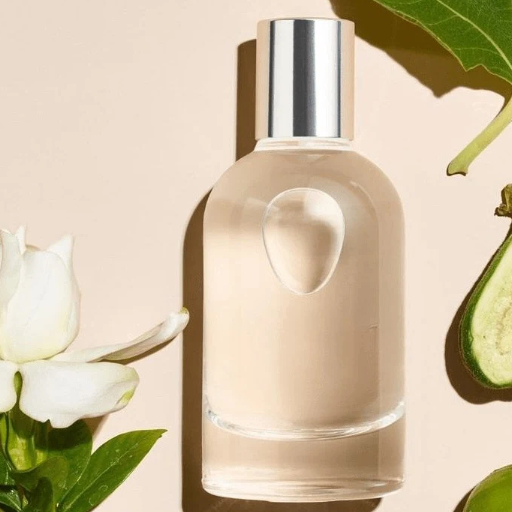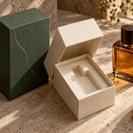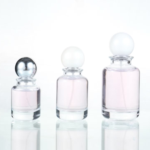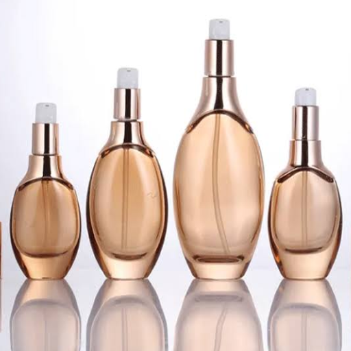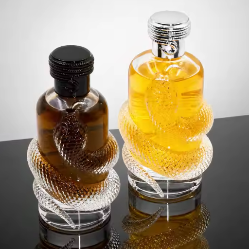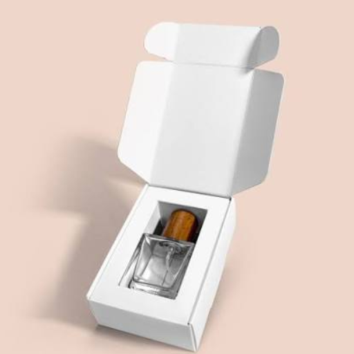
Luxury perfume packaging design comes down to a handful of deliberate choices: heavy, tactile materials, a restrained color palette, refined typography, generous negative space, and one or two precision finishes applied as a single coordinated system across the bottle, cap, insert, and box. Get those right and a 60fragrancecanfeellikea60fragrancecanfeellikea200 one before a single spray.
Here’s the counterintuitive part. The most expensive-looking perfume boxes are usually the ones with the least on them. When you’re designing fragrance packaging, restraint does more work than ornament.
Key Takeaways
- Luxury is a system, not a feature: the bottle, cap, insert, and box have to feel like one decision.
- Minimalist packaging raises consumers’ willingness to pay by 24.6%.
- Tactile feel and texture matter more than color or printed claims in driving perfume purchases.
- Quiet luxury uses warm neutrals, blind debossing, and negative space, not gold foil everywhere.
- A soft-touch finish and a debossed logo on an 18pt board can make even a folding carton read as premium.
You already know packaging matters. What most brands don’t know is which design choices actually create the luxury signal, and which ones just add cost. This guide maps the exact color, typography, layout, and finishing decisions that make fragrance packaging feel expensive, then shows you how to hand those decisions to a manufacturer so they survive production.
What Is Luxury Perfume Packaging Design?
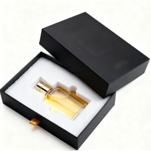
Luxury perfume packaging design is the craft of orchestrating color, typography, layout, and tactile finishes across the bottle, cap, insert, and outer box to signal exclusivity, protect the fragrance, and create a memorable unboxing moment. In luxury packaging, restraint, weight, and precision do the talking rather than ornament.
The key word is system. A luxury box around a cheap-feeling bottle fails. So does a beautiful bottle dropped into a plain carton. The design only works when every component reinforces the same idea. That’s why the best fragrance brands design the whole package as one object, not four separate pieces.
If you want the full picture of how those pieces fit together, start with our custom perfume packaging guide, which walks through bottles, caps, labels, and the box as a complete system.
Why Design Decides the Sale Before the Scent Does
Perfume is what marketers call an experience good. A shopper can’t evaluate the scent through the shelf or a screen, so they rely on the packaging as a stand-in for quality. The numbers bear this out.
Roughly 73% of purchase decisions happen at the point of sale, which is why packaging has long been called the “silent salesman.” A 2025 structural study of the perfume market went further: packaging design was the single most influential factor on purchase intention, ahead of materials and typography.
Even more telling is which design attributes move the needle. In consumer testing, tactile experience scored highest, followed by texture and materials. Weight ranked lowest. Translation: how a box feels in the hand matters more than how heavy it is or what’s printed on it.
For fragrance specifically, the container matters even more when it’s a gift than when it’s a personal purchase. A gift box is part of the present, so its design quality is evaluated directly.
The practical takeaway: your design budget should go to touch and texture first, print decoration second. We’ll return to this when we build the design sequence.
The Design Sequence: Bottle, Cap, Insert, Box, Graphics
Most brands make the mistake of designing the box first, then fitting the bottle into it. Luxury designers work inside-out.
1. Bottle. The bottle sets the physical footprint and the silhouette the whole package wraps around. Its height, shoulder shape, and weight define how much room the insert and box need.
2. Cap and collar. The cap is the first thing a hand touches. A weighted Zamac or metal cap with a magnetic snap signals quality faster than any printed word. The collar ties the cap to the bottle visually.
3. Insert. The insert holds the bottle in place and creates the reveal. A velvet, satin, or precision-cut EVA insert turns an opening into a ceremony.
4. Box. The rigid box or carton wraps everything and delivers the first visual impression. Its structure, from magnetic closure to drawer to lift-off lid, sets the unboxing choreography.
5. Graphics and finishing. Only now do color, typography, and finishes get applied, because they have to sit correctly on the structure that already exists.
Designing in this order prevents the most common luxury-packaging failure: beautiful graphics on a box that doesn’t match the bottle inside. When each stage constrains the next, the package reads as one coherent decision.
Color Psychology: The Quiet-Luxury Palette
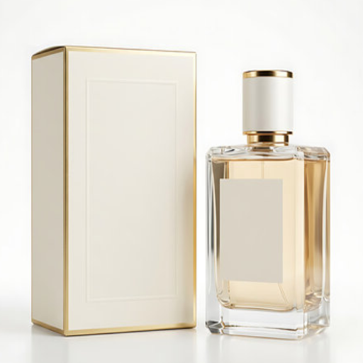
Color is the loudest element in your design, and in luxury fragrance packaging, loud is usually wrong.
The 2026 luxury standard is a warm, tactile form of restraint often called “quiet luxury.” The palette is built from expensive neutrals: sand, slate, charcoal, warm bone, and soft navy, with a single accent like blush or a restrained gold. What defines these colors is what they avoid: stark white and saturated primaries.
There’s a scientific layer to this too. Research on color-odor correspondence shows that when packaging color matches a fragrance’s character, the product reads as more coherent and more appealing. Color is a scent cue before it’s a decoration.
Consider the basic mappings:
- Citrus and green fragrances read fresh in pale green or yellow.
- Rose and floral notes suit blush, pink, or soft coral.
- Oud, amber, and tobacco suit deep brown, bronze, or muted gold.
- Marine and aquatic scents work in blue or cool grey.
- Musky, dark, or nocturnal scents suit black and charcoal.
Here’s the nuance the data surfaces: color is context-dependent. One study found color had no significant standalone effect on perfume purchase intention, while design and materials did. So treat color as a supporting player, not the lead. It should reinforce the scent story and the brand, not carry the entire luxury signal on its own.
Priya, an in-house designer at a Dubai fragrance house, learned this the hard way. She paired a fresh bergamot scent with a deep burgundy box because it “felt premium.” Test groups read the fragrance as heavy and oriental before they ever smelled it. When she shifted the packaging to a pale citrus green with minimal type, perceived freshness jumped and the box finally matched the promise inside. The lesson stuck: match color to the scent first, decoration second.
Typography and Layout That Signal Expensive
Typography is where luxury packaging quietly separates itself from everything else on the shelf.
Understated type. Luxury brands favor refined serifs, spaced small caps, and disciplined letterforms. Think engraved, not printed. Frédéric Malle prints nothing on its bottles but the perfumer’s name and the fragrance name. No marketing language, no claims, no decorative type. That restraint is the signal.
Negative space. In luxury design, empty space is a feature, not wasted real estate. A sparse layout tells the buyer the product doesn’t need to shout. Fill every inch with text and the package reads as a coupon insert.
What to leave off. Every claim you add, from “long-lasting” to “premium quality,” subtracts a little perceived value. The quiet-luxury rule: if the box has to tell you it’s expensive, it probably isn’t.
A useful test is to ask what a buyer remembers after seeing the box for two seconds. If they remember your logo and the scent name, you’ve designed well. If they remember the discount sticker, you haven’t.
Quiet Luxury vs. Loud Luxury: Which Is Right for Your Brand?
Quiet luxury isn’t the only path. Ornament still works in the right context. The skill is knowing which lane your brand belongs in.
| Quiet Luxury | Loud Luxury | |
|---|---|---|
| Signal | Restraint, confidence, taste | Opulence, abundance, status |
| Palette | Sand, slate, charcoal, bone, navy | Gold, black, deep jewel tones |
| Type | Refined serif, small caps, sparse | Bold, ornate, decorative |
| Finish | Blind deboss, soft-touch, one foil accent | All-over foil, heavy embossing, crystals |
| Best for | Niche and contemporary brands, EU/NA markets | Gifting, Middle East, limited editions |
The geographic layer matters more than most brands realize. European and North American buyers increasingly reward restraint. Middle Eastern markets, where fragrance is deeply tied to gifting, reward opulence and gold. Asian markets, especially China, value refinement but also auspicious color and a sense of occasion. Design for the market you’re actually selling into.
Elena’s story shows what happens when you get this wrong. She launched a niche perfume label in March 2026 believing luxury meant more of everything: more gold foil, more ornament, more color on every panel. The result looked busy, not expensive, and her debut collection stalled. A redesign stripped the box to a warm charcoal soft-touch board, a blind-debossed wordmark, and two lines of type. Within one quarter, her repeat purchase rate doubled. Restraint didn’t just look better. It sold better.
8 Design Moves That Make Packaging Look Expensive
These are the specific, repeatable moves behind most premium fragrance packaging. Use them selectively. Combining all eight usually ruins the effect.
- Weight and tactility. Start with a heavy board and a soft-touch or velvet laminate. The hand signals quality before the eye does.
- Blind debossing. A logo pressed into the board without ink reads as engraved. It’s the single most cost-effective luxury finish.
- Restrained foil. Hot foil stamping is the most powerful luxury signal available on a carton, but it works best as one accent, not full coverage.
- Negative space. Leave at least half the front panel empty. The emptiness is the luxury.
- Expensive neutrals. Build from sand, slate, charcoal, and bone, with one accent color at most.
- Refined type. A spaced serif or small-cap wordmark says “house” far better than a script that tries to say “expensive.”
- Print the interior. A colored or patterned interior extends the design past the shelf and into the unboxing moment.
- A precision insert and a controlled reveal. A velvet-wrapped EVA insert and a magnetic or ribbon-assisted opening turn a box into an experience.
Watch a rigid magnetic perfume box come together to see how the closure, insert, and reveal work as one motion:
Want to see these finishes in action? Request a free sample and we’ll send physical swatches of soft-touch, foil, and debossing so you can feel the difference before you commit.
Designing Luxury on a Budget
You don’t need a $5 rigid box to look expensive. You need to spend your budget on the moves that actually read as luxury.
Soft-touch lamination, blind debossing, and negative space are high return. Full-coverage foil, heavy ornament, and elaborate structures are low return for most brands. Put your money in the hand feel and the deboss, and let the layout carry the visual weight.
Here’s a rough sense of what each tier buys:
- Premium (1.50to1.50to3.00 per unit): a well-built folding carton on 18pt or heavier board, soft-touch finish, and a blind-debossed logo.
- True luxury (3.00to3.00to5.00+ per unit): a rigid box with magnetic or drawer closure, premium wraps, precision inserts, and selected foil accents.
James ran a small e-commerce brand with a $2.50 per-unit budget, nowhere near a rigid box. Instead of all-over foil, he chose a soft-touch laminate, a blind-debossed logo, and a single gold foil accent line on 18pt board. Customers routinely described the box as “luxury,” and his unboxing photos started earning shares he never paid for. The box felt expensive because the money went to feel, not print.
When you’re ready to scale production, our wholesale perfume boxes guide covers volume pricing and minimum order quantities across both carton and rigid options.
From Design File to Luxury Box: The Production Handoff
A luxury design only survives production if you hand it over correctly. This is where most designer-to-manufacturer failures happen.
Dielines, bleed, and safe zones. Every box has a dieline showing where it folds and cuts. Keep text and logos inside the safe zone, extend background art into the bleed, and your design won’t be clipped or off-center.
Pantone vs. CMYK. Metallics and brand-critical colors should be specified as Pantone spot colors, not approximated in CMYK. Foil and metallic consistency depends on it.
Foil and emboss art specs. Foil and deboss require separate vector layers with clear placement. Embossing needs enough board thickness to hold the depth: 18pt or higher for a clean emboss, with 28pt as the practical ceiling.
Registration tolerances. The difference between luxury and cheap is often a fraction of a millimeter. Foil and emboss registration is held to about ±0.3mm. A millimeter of drift reads as a quality failure on a luxury box. That’s also why the restraint approach helps: fewer elements means less that can drift out of alignment.
The good news is that a manufacturer who understands design, not just printing, will flag these issues before they become problems. That’s the advantage of working with a supplier who builds luxury packaging from the design stage through production rather than one who only prints whatever file you send.
Frequently Asked Questions
What makes perfume packaging look luxurious?
Weight, texture, and restraint. A heavy soft-touch board, a blind-debossed logo, generous negative space, and one refined foil accent signal luxury far more reliably than ornament or bright color.
How do I make my packaging look expensive on a budget?
Spend on hand feel and a deboss. A soft-touch laminate, an 18pt board, and a blind-debossed logo on a folding carton will read as premium at a fraction of a rigid box’s cost.
What colors are used in luxury perfume packaging?
Warm, muted neutrals dominate: sand, slate, charcoal, warm bone, and soft navy, often with a single accent like blush or restrained gold. The palette should also match the fragrance’s scent family.
What is quiet luxury packaging?
A 2026 design movement defined by warm, tactile restraint. It favors textured papers, embossed finishes, magnetic closures, and expensive neutrals over stark white minimalism, with sustainability built into the design rather than added on.
Does packaging design really influence perfume sales?
Yes. Packaging design is the single most influential factor on perfume purchase intention, and around 73% of purchase decisions happen at the point of sale. Touch and texture matter most.
Conclusion
Luxury perfume packaging design isn’t about adding more. It’s about making a handful of decisions deliberately and letting restraint do the work. Design the package as one system from the bottle out, match color to the scent, let typography and negative space speak quietly, and put your finish budget into feel and a deboss rather than ornament.
The brands that get this right sell the promise of a fragrance before the first spray. Minimalist packaging raises willingness to pay by 24.6% for a reason: it reads as confidence, and confidence is what luxury actually is.
Ready to put these principles into production? Get a custom luxury perfume packaging quote from Fuzhou Longlu Packaging, and our team will help you spec materials, finishes, and dielines that turn your design into a box that feels as expensive as the fragrance inside. If you want the full system-level view first, revisit our custom perfume packaging guide or explore our sustainable packaging guide to make sure your premium design is also a responsible one.